Timeline
14 months
My Role
Lead Product Designer - Full stack
Team
Product, Revenue Management, Engineering
Scope
Research, UI Design, Prototyping, Rollout
13%
Reduction in rates-related support tickets
30%
Growth in weekly active users
Outcomes
Responsive Web + Native App
Revenue Data Visualization for Vacasa Owner Account Portals
Understanding The Problem
I analyzed 500+ support tickets and owner exit data. The signal about revenue performance was clear.
51%
Of churning owners cited revenue concerns as their reason for leaving
NPS detractor analysis · 18K+ ratings & comments · 2022–2023
43%
Named Vacasa's rate-setting specifically
NPS detractor analysis · 18K+ ratings & comments · 2022–2023
Discovery
20+ owner interviews revealed they were filling a gap we had created with services like AirDNA.
Owners were paying for data services, referencing Airbnb, and calling competitors for data Vacasa already had. A follow-up survey of 219 owners confirmed it that every single one wanted access to market data.
But deeper interviews surfaced a harder problem — owners didn't just want market data. They wanted to know which specific properties Vacasa was comparing them to. Legal forbade it.

1
AirDNA dashboard
Design Direction
Legal constraints meant I couldn't show individual comps — so I designed around what I could.
The design problem became: How do you make a rate range legible, trustworthy, and actionable for owners across every level of data literacy?
Market rate range
Owner’s rate
Rolling 12-month forward view
Specific comparable properties
Shaded band - aggregate min/max of advertised rates from comparable propertyer
Bold overlaid line - their home’s advertised nightly rate plotted against the market band
Time axis from today forward - revealing seasonal rate patterns ahead
Legal constraint - individual data not permitted


Today


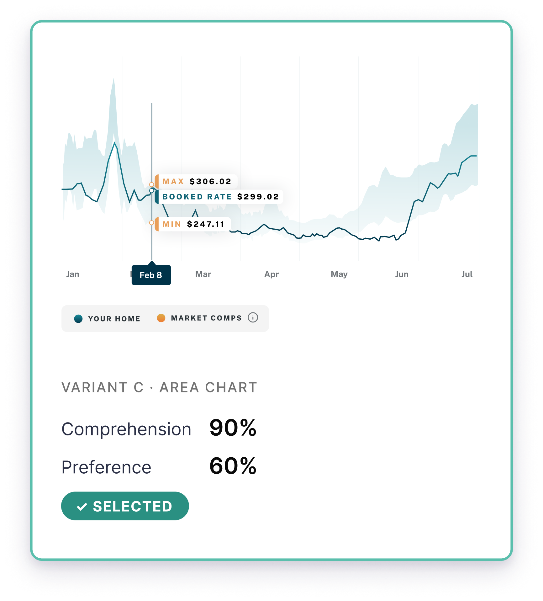
Research
I tested three visualization approaches before committing and an area chart was a clear winner.
Comprehension — not preference — was the deciding metric. An owner who prefers a chart they can't correctly read is worse than no chart at all.
Jan
Feb
Mar
Apr
May
Jun
Jul
Vacasa
MAx comps
Min comps


Variant B · Scatter Plot
Comprehension
40%
Preference
5%
Variant C · Line Graph
Comprehension
60%
Preference
35%
2


Max Comps

Your Home
Min Comps


Jan
Feb
Mar
Apr
May
Jun
Jul
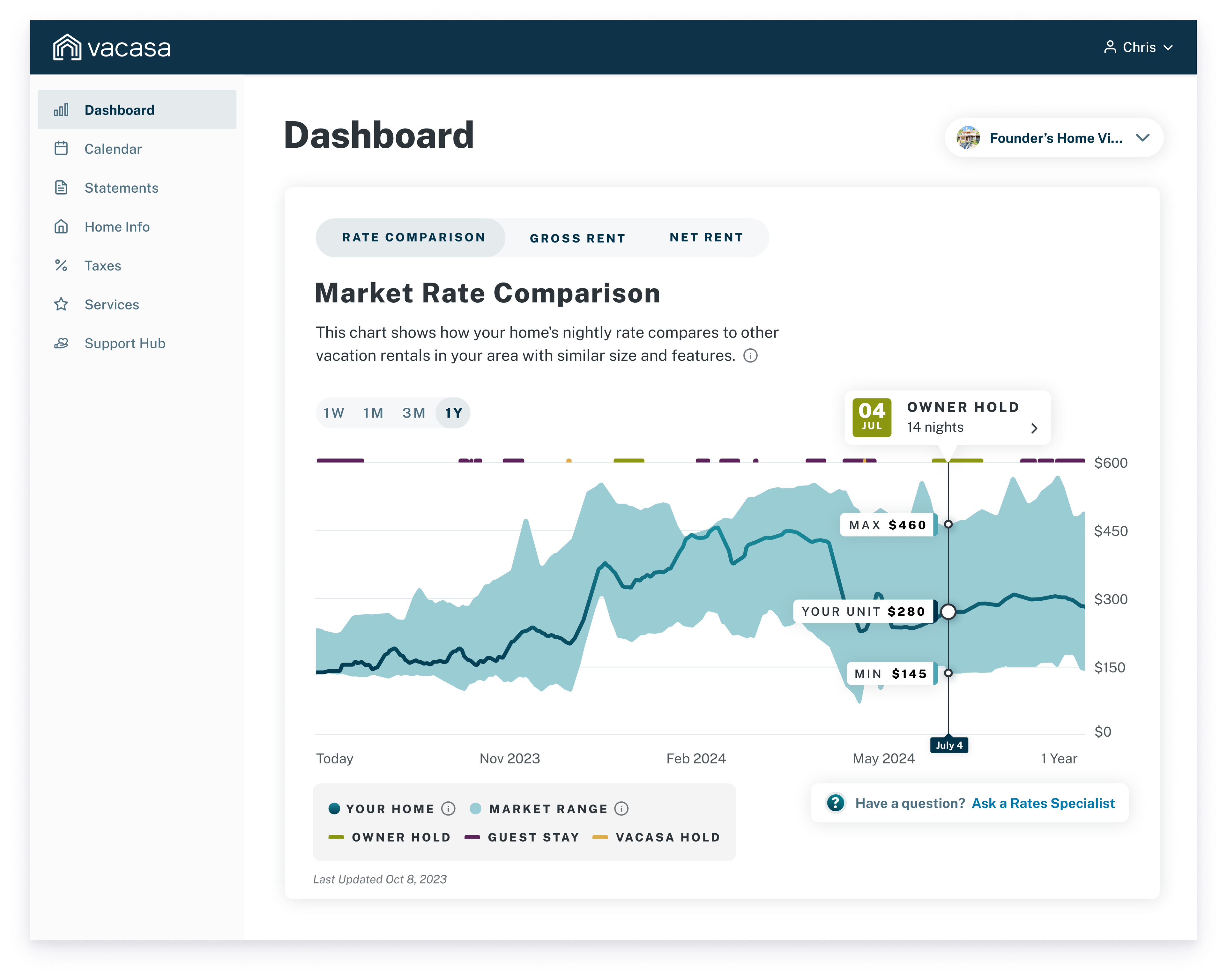
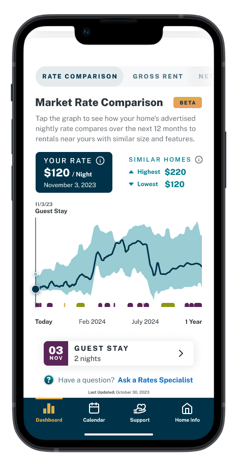
The Solution
3
A shaded band showing the market range. The owner's rate as a distinct overlaid line. Scenario-specific hover states that explained what the data meant for that owner's specific situation — not just what it showed.
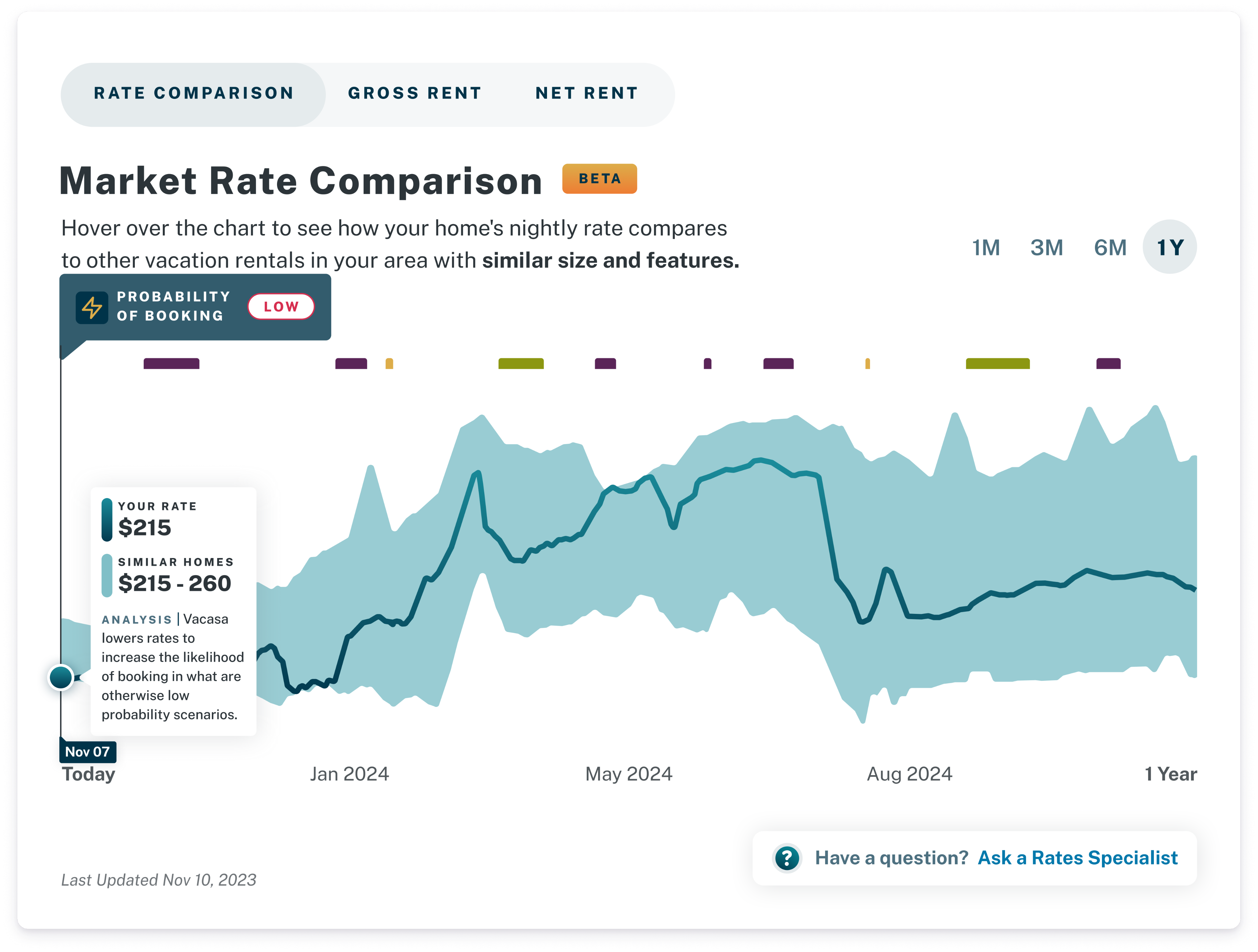
Contextual hover state
Native Light and Dark views
Second Release V2
4
The design gave owners their first clear view of where their rate sat in the market and where it was headed.
Results
We made real gains, but realistically there were limits.
The tool moved the metrics it could move. Churn was driven by a combination of factors well beyond pricing visibility — operational issues, communication gaps, and service consistency problems no single feature was positioned to fix.
+30%
Growth in weekly active users
+13%
Reduction in rates-related support tickets
3
The Direction
The research pointed clearly to what a complete solution required, but the project was abandoned.
We were building to give owners real booked rates, visible comp set, and verifiable comparisons owners could trust. The design was done. The data partnership was in place. This is the version I'd build next.
5
In Reflection
Designing this taught me that visualization is as much a trust problem as a clarity problem. I can make data legible, but I can't make it trustworthy if the underlying data doesn't earn it. Next time: test with real data earlier, and ask users what they'd need to trust it.

© 2026 Dan Rattigan
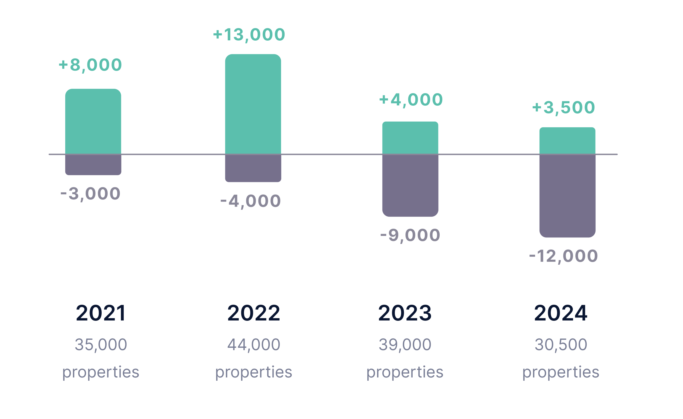
Context of the Problem
By 2023, Vacasa (the largest vacation property manager in the US) was losing 1,000+ owners a month to competitors promising better returns.
Internally, we knew those promises were hollow — but owners had nothing from Vacasa to help them see it. Without visibility into how their nightly rate compared to the market, they were left to draw their own conclusions.

Property Growth vs. Homeowner Churn Rate
Property Growth vs. Homeowner Churn Rate
My Role
Sole Lead Product Designer - Full stack
Timeline
14 months
Team
Product, Revenue Management, Engineering
Scope
Research, UI Design, Prototyping, Rollout
Outcomes
13%
Reduction in rates-related support tickets
30%
Growth in weekly active users
Responsive Web + Native App Experience
Revenue Data Visualization for Vacasa Owner Account Portals
The design gave owners their first clear view of where their rate sat in the market ( . ) and where it was headed.
Context
By 2023, Vacasa (the largest vacation property manager in the US) was losing 1,000+ owners a month to competitors promising better returns.
Internally, we knew those promises were hollow — but owners had nothing from Vacasa to help them see it. Without visibility into how their nightly rate compared to the market, they were left to draw their own conclusions.
The Problem
I analyzed 500+ support tickets and owner exit data. The signal about revenue performance was clear.
51%
Of churning owners cited revenue concerns as their reason for leaving
NPS detractor analysis · 18K+ ratings & comments · 2022–2023
43%
Named Vacasa's rate-setting specifically
NPS detractor analysis · 18K+ ratings & comments · 2022–2023
Discovery
20+ owner interviews revealed they were filling a gap we had created with services like AirDNA ( ).

1
Owners were paying for data services, referencing Airbnb, and calling competitors for data Vacasa already had. A follow-up survey of 219 owners confirmed it that every single one wanted access to market data.
But deeper interviews surfaced a harder problem — owners didn't just want market data. They wanted to know which specific properties Vacasa was comparing them to. Legal forbade it.
v

Screenshot of AirDNA dashboard
1

3
Design Direction
Legal constraints meant I couldn't show individual comps — so I designed around what I could ( ).
The design problem became: how do you make a rate range legible, trustworthy, and actionable for owners across every level of data literacy?
Market rate range
Owner’s rate
Rolling 12-month forward view
Specific comparable properties
Shaded band - aggregate min/max of advertised rates from comparable propertyer
Bold overlaid line - their home’s advertised nightly rate plotted against the market band
Time axis from today forward - revealing seasonal rate patterns ahead
Legal constraint - individual data not permitted


Today


3


Research
I tested three visualization approaches before committing and an area chart was a clear winner ( ).
2
Comprehension — not preference — was the deciding metric. An owner who prefers a chart they can't correctly read is worse than no chart at all.
Jan
Feb
Mar
Apr
May
Jun
Jul
Vacasa
MAx comps
Min comps

Variant A · Scatter Plot
Comprehension
40%
Preference
5%
Variant B · Line Graph
Comprehension
60%
Preference
35%
2


Max Comps

Your Home
Min Comps


Jan
Feb
Mar
Apr
May
Jun
Jul
The Solution
4
A shaded band showing the market range. The owner's rate as a distinct overlaid line. Scenario-specific hover states that explained what the data meant for that owner's specific situation — not just what it showed.

Contextual hover state
Native Light and Dark views
4
Results
We made real gains, but realistically there were limits.
The tool moved the metrics it could move. Churn was driven by a combination of factors well beyond pricing visibility — operational issues, communication gaps, and service consistency problems no single feature was positioned to fix.
+13%
Reduction in rates-related support tickets
+30%
Growth in weekly active users
The Direction
The research pointed clearly to what a complete solution ( ) required, but the project was abandoned.
We were building to give owners real booked rates, visible comp set, and verifiable comparisons owners could trust. The design was done. The data partnership was in place. This is the version I'd build next.
5

5
In Reflection
Designing this taught me that visualization is as much a trust problem as a clarity problem. I can make data legible, but I can't make it trustworthy if the underlying data doesn't earn it. Next time: test with real data earlier, and ask users what they'd need to trust it.

© 2026 Dan Rattigan